Finding Out About Places : A mini-lesson
 When we see, hear or read about places we don't actually know, we will only get part of the story. Even if you were asked to describe an area as small as your bedroom you would have to decide what detail to include and what to ignore. You might mention the colour of the walls, but would you list all the scratch marks, tiny bumps and bits of sticky tape on them too?
If you could photograph the room you would probably take some general pictures, but would you photograph under the bed, in a drawer, or take a close up of the plug socket?
Now imagine that you have a good reason to describe your room - perhaps a parent has said you can only have a certain reward if you keep the room tidy, or an older brother wants your room and you are trying to put him off having it. You'd take two different approaches to how you described it wouldn't you? If you want the reward you'd describe the room as clean and tidy, with photographs of it looking clean and bright, no rubbish and the table / bookcase looking the way your parents want it to look. But if you wanted to put your big brother off, you'd make it seem too small, too dark, untidy and whatever he would not like.
This is called bias, and it means changing the way you present something so it suits your aims. Newspapers, charities, shops and travel agents are just a few of the organisations that often provide biased information about places, because it suits their aims to do so.
Would people go on holiday to a place described as 'the filthiest, most disgusting hotel I've ever seen, built next to a fish processing factory' or to 'the brightest, cleanest and most friendly hotel I've ever discovered, right next to the perfect beach'.?
Finding out about places can be much the same; some sources will say one thing, and others will say something quite different. As geographers you need to be able to recognise this and come to your own conclusions about the places you study.
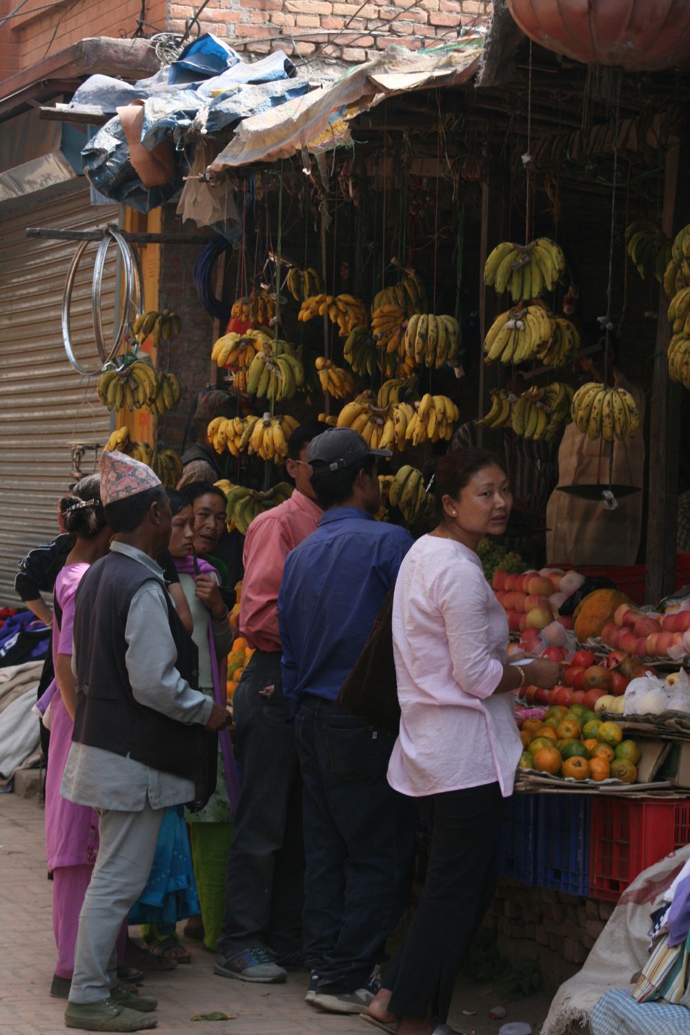
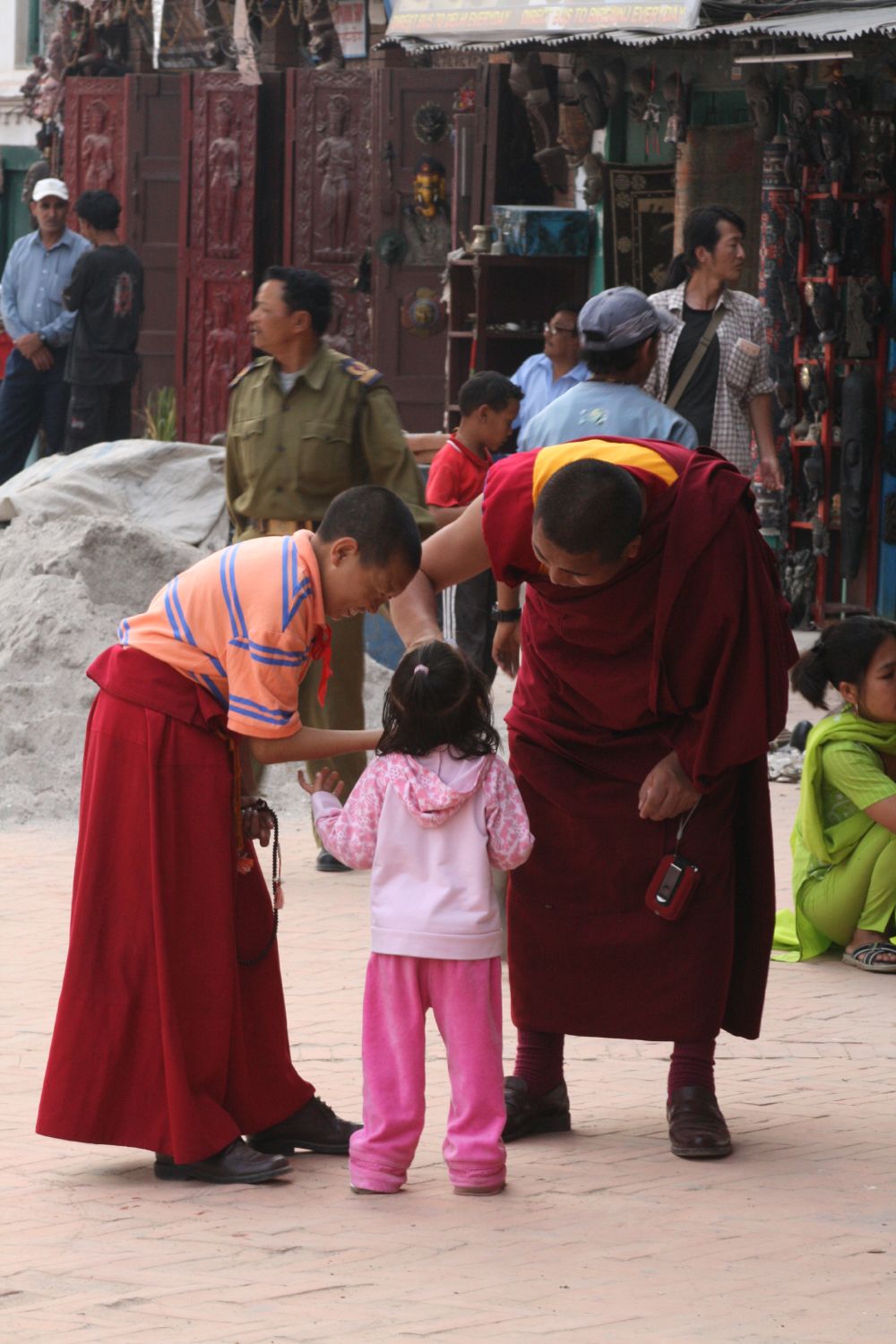
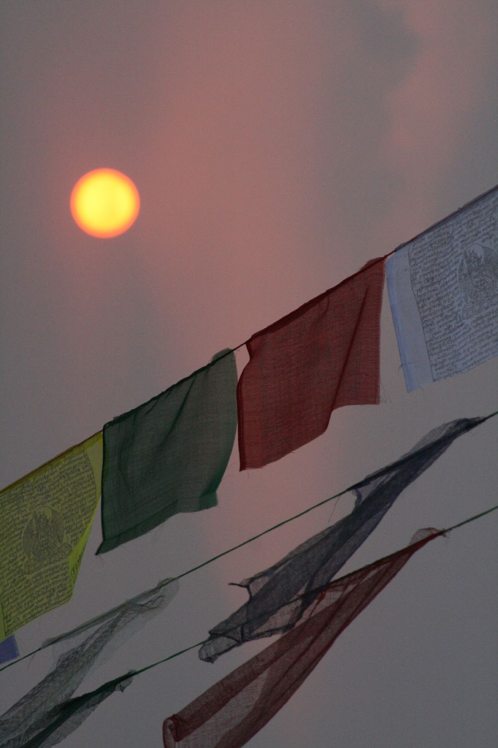
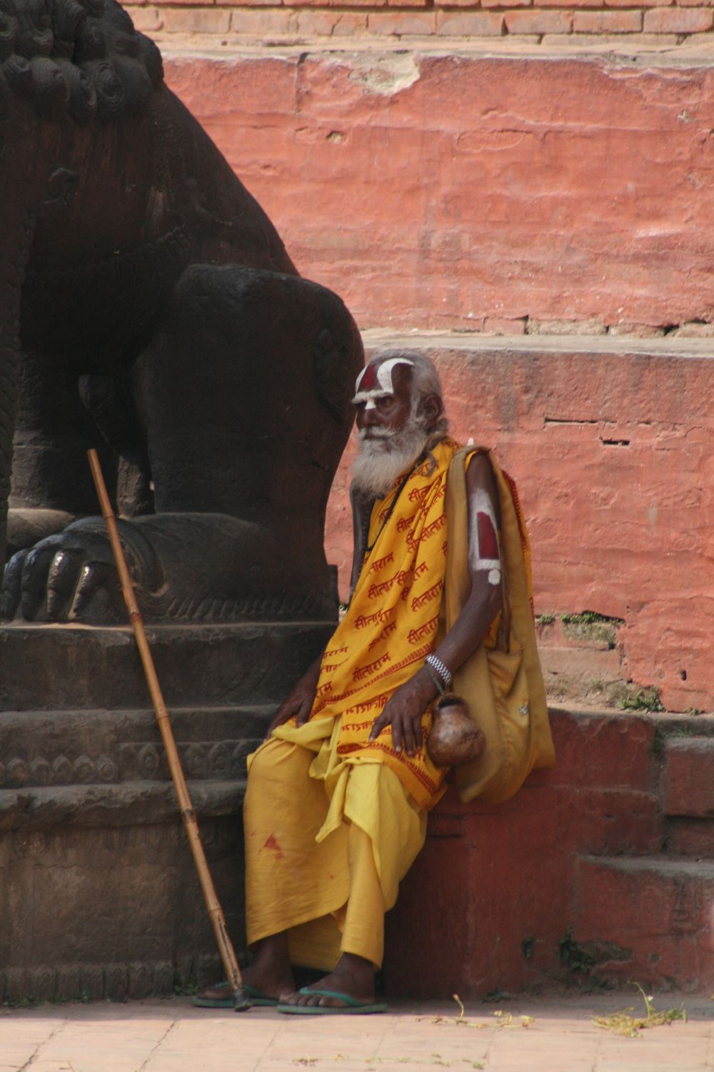
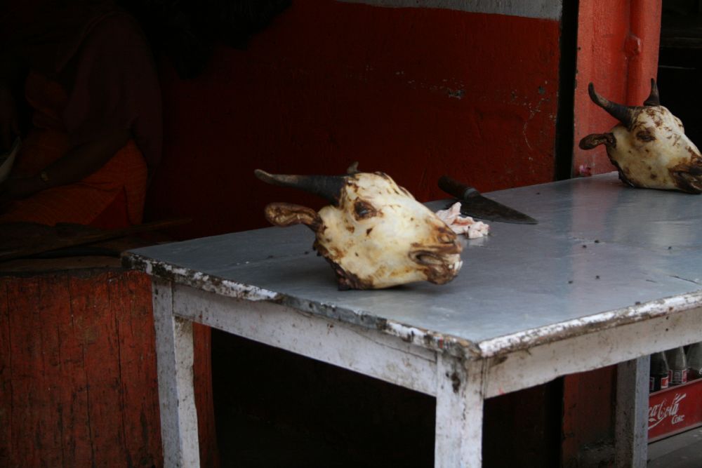
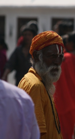
Working on your own, examine the photographs in the boxes, then answer the questions.
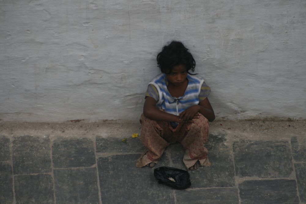
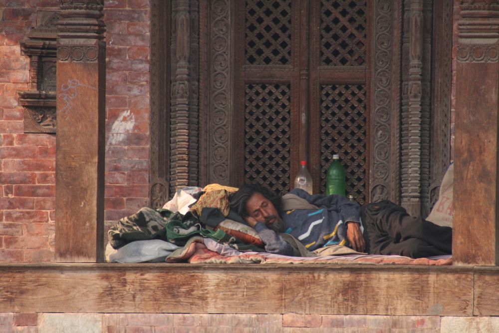
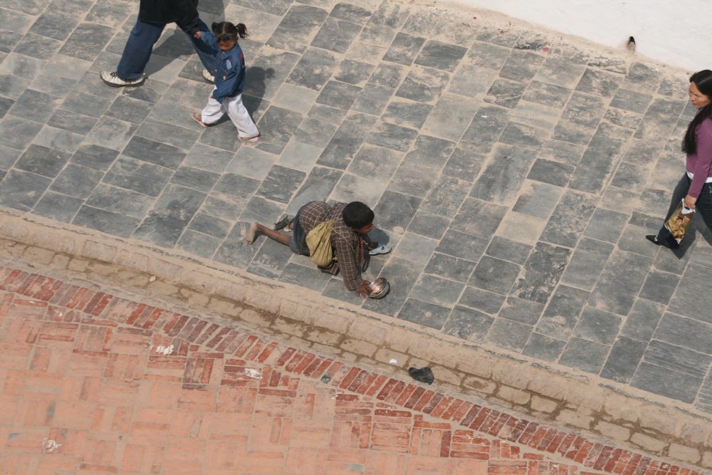
1. Imagine you are producing a leaflet about hunger and lack of food.
a) Which image would you be most likely to use in your leaflet? In a few sentences explain why you choose that photograph.
b) Which image would you be least likely to use? In a few sentences explain why.
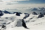
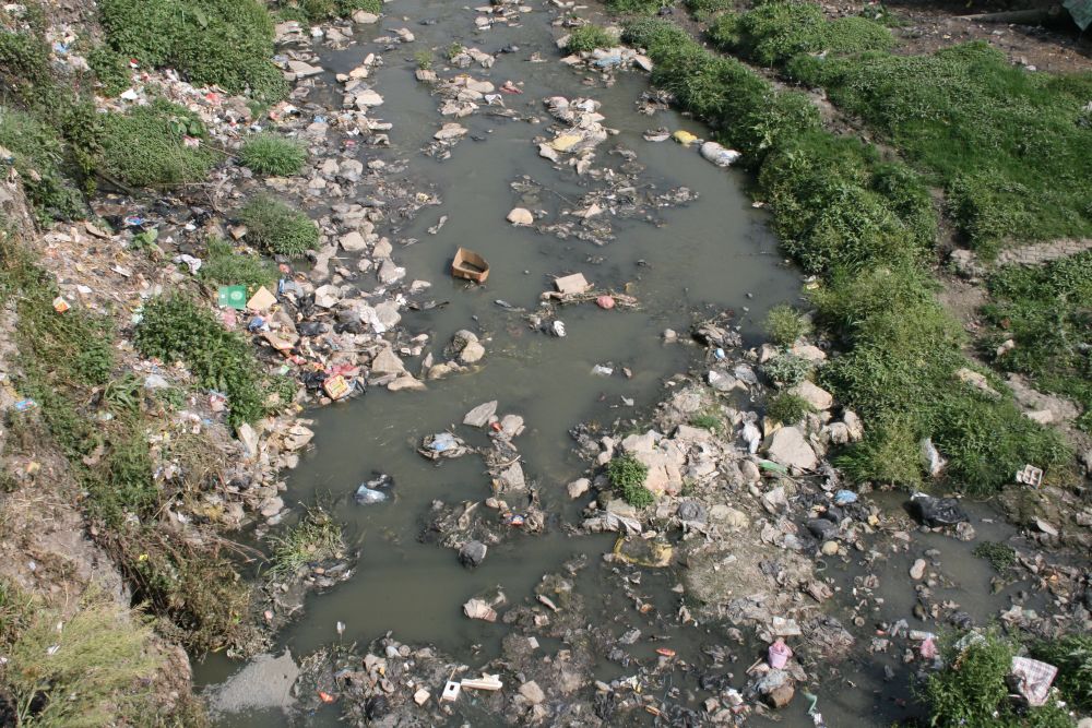
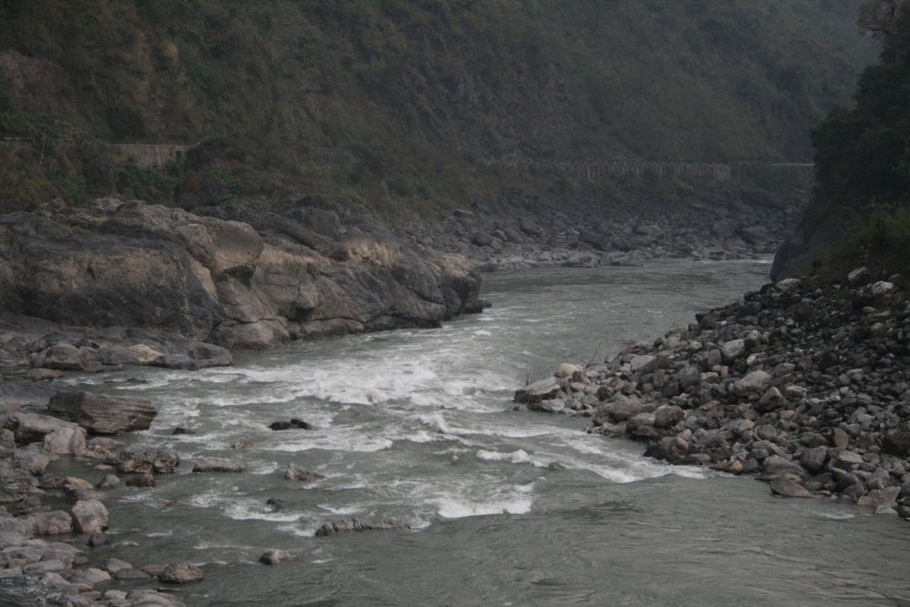
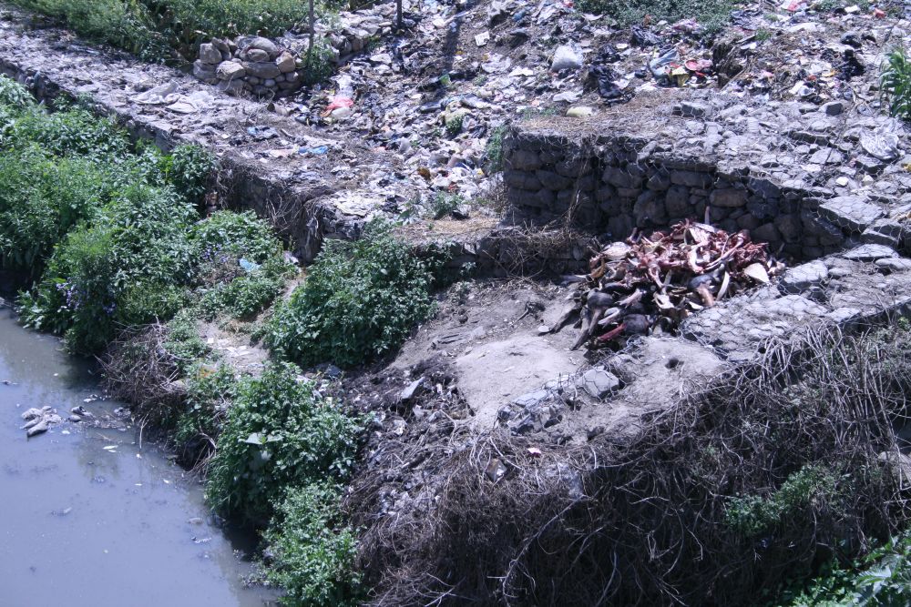
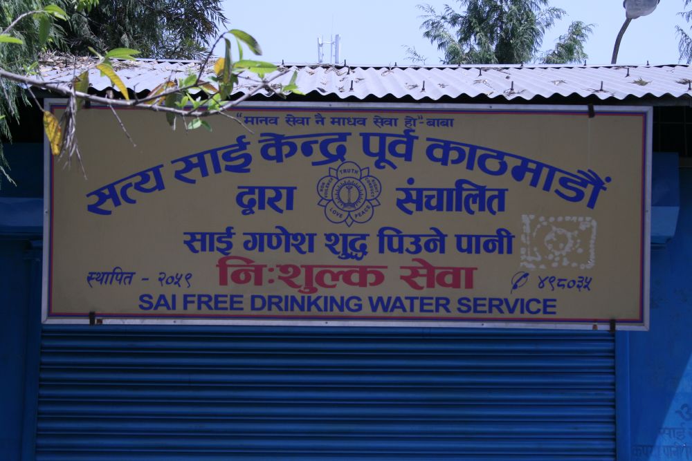
2. If you produced a poster about the quality of the water supply in Nepal...
a) Which two photographs would you use to show that Nepal has clean water and fresh rivers?
b) Which two would you use to show that it has terrible water pollution?
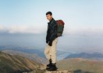
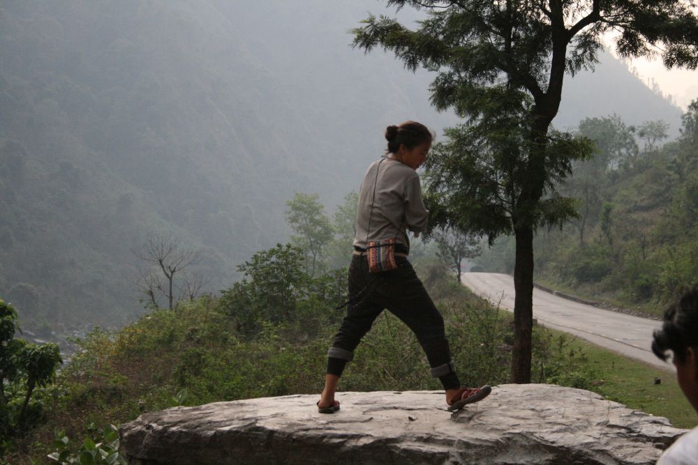
3. In a small group, look at photographs 1 and 14.
They both show young people in Nepal, but what do you think when you look at the pictures? Do you have the same thoughts when you look at each picture, or different thoughts?
a) Imagine you were the photographer. What do you think was happening before and after the pictures were taken? What were the people doing, how did they feel, and what happened next? Write a couple of paragraphs for each of the pictures, explaining what you think the young person is doing, why they are there, and how other people might react to them.
b) As a group discuss the ideas you had about these two pictures. Did the class have the same ideas or did everyone come up with completely different ideas?
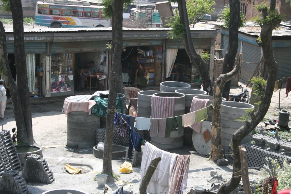
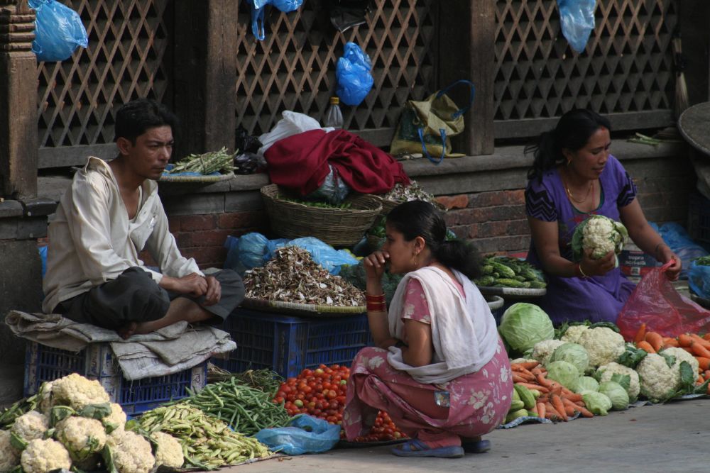
4. How would you describe Nepal, using just these images?
a) Write a description of Nepal, based on just what you can see in these pictures? What can you say about the buildings, the people, economy, foods, water supply, religion and life style? Be a detective and try to work out as much as you can, then exchange the information with the other people in your class.
b) Now research Nepal on the Internet and find out about the topics you wrote about in part (a). Was your description of Nepal accurate, or have other sources told you a different story?
1 |
2 |
3 |
4 |
5 |
6 |
7 |
8 |
9 |
10 |
11 |
12 |
13 |
14 |
15 |
16 |
![]()